Alice in Wonderland Project

Hello!

June is almost over (where does the time go, really??) and I've finished up my monthly project. As you know, I've been focusing on BOOKS. Specifically, I have been working on some illustration and page samples for Alice's Adventures in Wonderland. Shown here is what I ended up with. I had a lot of fun especially with the cover, which allowed me to explore lettering, composition, and characters. I hope you like it!

Sincerely, Nicole

Book Design 101: Interiors

Have you ever thought about what it takes to bring a manuscript to life into a fully realized printed book?

Perhaps you are a writer yourself and are thinking about self-publishing. Or an aspiring graphic designer. Or maybe you just love books. Either way, I'd like to share some of the knowledge I've accumulated throughout the years working as a book typesetter and designer. The content below specifically deals with the interior, as that's where the majority of my experience lies!

Photo by Brandi Redd on Unsplash

Photo by Brandi Redd on Unsplash

For this purpose, I've laid out a sample chapter from Alice in Wonderland with a simple, straightforward design.

I invite you to take a look at these pages before and after going through the rest of this article to see how your perception of the design changes after you gain a little more knowledge about page design!

Terms to Know

BookInterior1.png
BookInterior2.png

margin: the white space between the text and the edges of the page

gutter: the inner margin

body: the main text

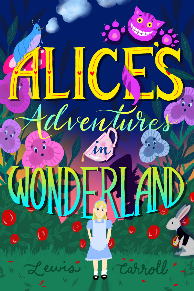
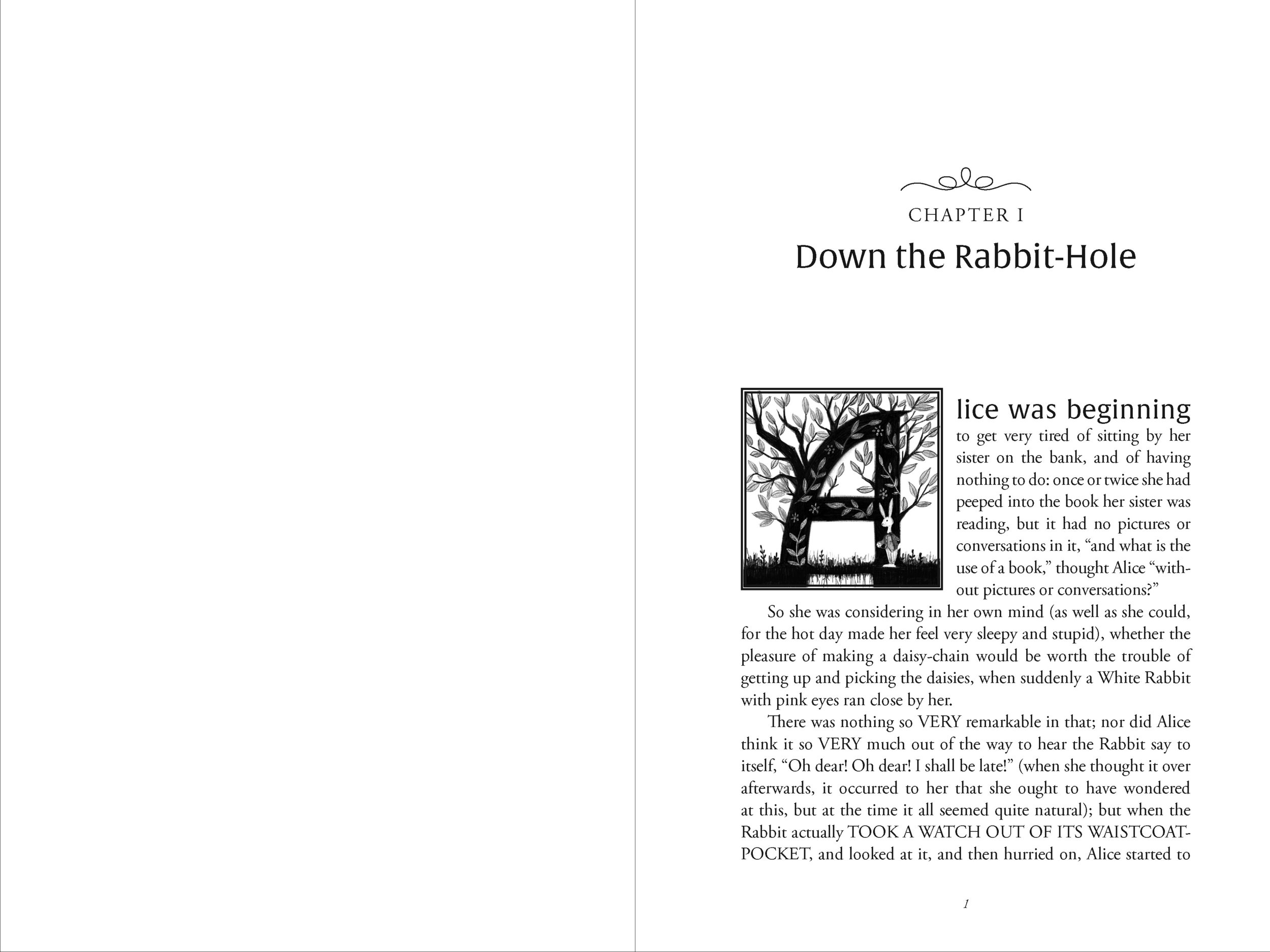
display fonts: special fonts that differentiate from the main text and add design flair; used in headings, title page, sidebars, etc.

text block: the area on the page taken up by text

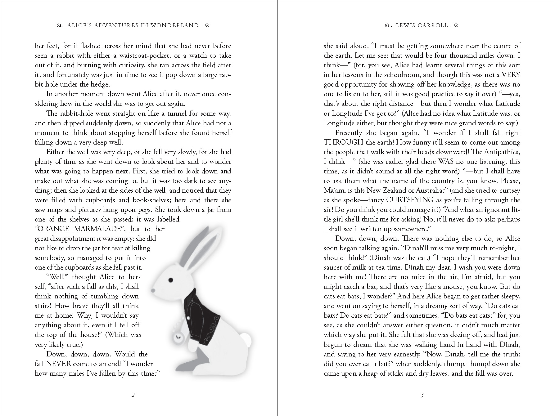
running head: text heading that runs on the top of each text page; usually contains info such as the book title, part or chapter titles, and/or the author's name

running foot: similar to the running head, but is found at the bottom of the page

folio: page number; this can be found at the top or bottom of the page, sometimes aligned with the running head or foot, if there is one; at the bottom of the page, it can be referred to as a "drop folio"

form or signature: Traditionally, books have been printed in multiples of 8 or 16 pages, which equals one signature. This has to do with the way the large sheets of paper are cut and sewn together to create the book pages. Whether a book's page count is required to fall on an even signature depends on the printer being used. Many digital POD sites like Createspace only need an even number of pages, however.

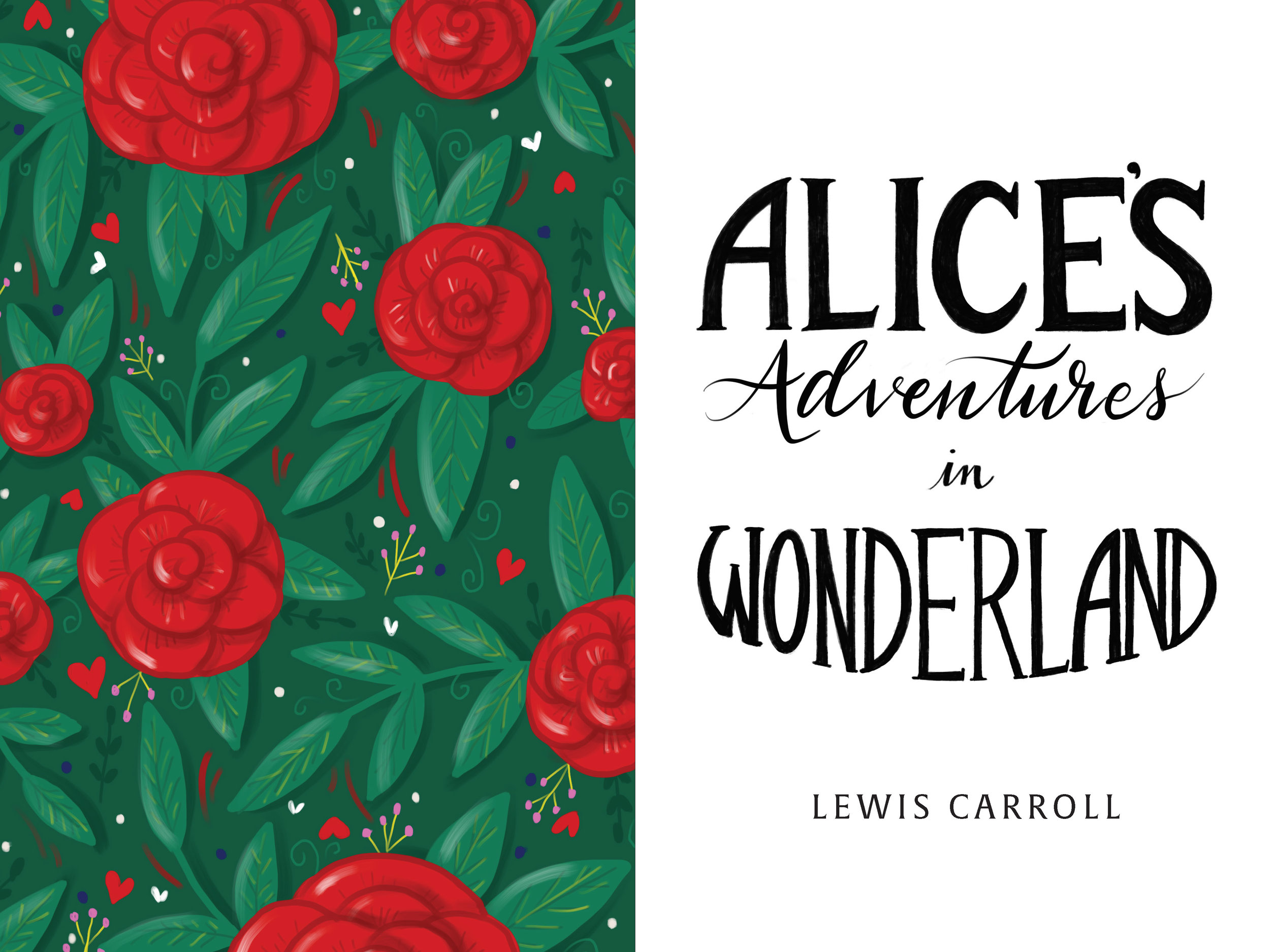
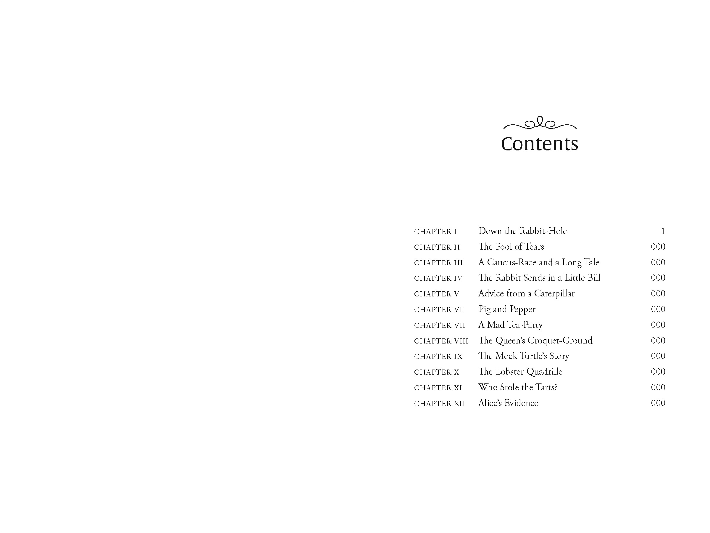
frontmatter: pages at the beginning of the book before the main content; usually comprised of the title page, copyright, dedication, foreword, and/or table of contents

backmatter: pages at the end of the book that aren't a part of the main content; usually includes things like the index, glossary, about the author, acknowledgments, and bibliography

spread: comprised of two pages (one left, one right) that fall side-by-side

recto: right-hand page

verso: left-hand page

Tips for Good Page Design

Perhaps you've never even noticed these things before, but I think you'll find that your page layouts will look a lot better by paying attention to these general rules...

Gutter: The gutter margin is often set wider than the outer margin. This is to compensate for the page space that is lost in the binding. The general rule is that higher page counts need larger gutter margins. Lower page counts (such as in picture books) don't necessarily need a larger gutter.

Typography: Keep the number of fonts to a minimum—usually 2 or 3. That's a good rule of thumb for ANY design project. I often have a main body font (usually serif), a display font (a contrasting typeface that fits the mood of the book), and, occasionally, a secondary text font (sans serif) for things like sidebars, callouts, and tables.

Blank space: Part of being a good designer is knowing when NOT to fill a space. Sometimes white area is ok, and will make your design look better. Some examples of where you could use white space are the above headings, around illustrations, "sinks" on your chapter opener pages (see diagram), or adding blank left-hand pages so your chapters and/or sections always start on a right-hand page. (Blank right-hand pages, however, are usually a no-no.) Also be sure to give your main body text some breathing room by using enough leading (space between lines). I generally set my leading at least 2 or 3 points above the font point size.

The fine details: There are several ways you can fine-tune your composition. Here are a few things to look out for that we often try to AVOID in publishing:

  • stacks - when the same word ends or begins two or more lines in a row; usually two lines are considered ok, but three or more stands out
  • widows - starting a page with a single line from the end of a paragraph
  • orphans - when a paragraph ends with a short word; it's best to end with a word or words that are longer than the width of the paragraph indent
  • 2-down hyphenation - allowing words to hyphenate with only two letters on the following line. Three or more letters are better.
  • loose/tight lines - just as it sounds—when the spacing of the words and letters looks too spaced out or compressed

Many of these issues can be fixed by learning to use composition features in your page layout software (i.e., H&Js, Keep Options, Tracking, etc.), and some require manual tweaking. With that in mind...

Use software specifically made for page layout to compose your book. By this, I do NOT mean Microsoft Word. Adobe Indesign is by far the most widely-used program and an industry standard. (A common alternative is Quark Xpress.) Yes, it is pricey and not for the casual user. If you are serious about diving into book design, Indesign is the way to go. There are cheap or free alternatives out there. But, seriously, use Indesign.

This is all just the tip of the iceberg when it comes to designing book interiors. I know I've learned a lot since I first started out, when I knew pretty much nothing. I think book design is something that might appear simple on the surface, but becomes overwhelming once you realize how much goes into it. Like anything, it takes a bit of work, practice, and experience.

When in doubt—there's always the option to hire a pro! ;)

I hope you've at least learned something new about book design today and can appreciate the process.

Sincerely, Nicole

Links

My Journey into Book Design

My Journey into Book Design

Things are getting back on track here as I get back into the swing of things following my vacation to New Hampshire. It was my intent to share more about my book design work before I got sidetracked with my busy schedule! Finally, I have found time to put some things together. I thought I would share my story of how I came to be a book designer.

Photo by Laura Kapfer on Unsplash

Photo by Laura Kapfer on Unsplash

The Beginning

I was hired to my first job as a book compositor a few months after graduating college. I had a general art degree, and little to no experience with books, so I had a lot to learn! After a short training period, my main task was to perform edits to books that had already been laid out. The company where I was employed had a variety of publishers and books they worked with, from textbooks to novels to children's books, so I got a lot of experience. As time went on, I gained more responsibilities and was assigned more complex tasks. Eventually, I was able to typeset books from scratch, starting with the author manuscript. At this point, however, I was not designing the books, but rather following templates already created by a separate designer.

At first, I did a lot of work in Quark Xpress, but the work eventually transitioned to almost exclusively Adobe Indesign. Thus began my experience with that program, which is the main software I use today.

This continued for many years. At first, I worked across the spectrum of publishers included in my company's clientele. As the company evolved, though, so did my role in it. In my latter years, I worked mainly with Scholastic books, which was a lot of fun for me since I have a love for the YA genre.

Diving into Book Design

When I left the company and began freelancing, I started offering my services not only to typeset, but also design books. Having so much experience as a compositor helped a lot. I now knew by experience the general layout of a book, how to tweak the text to create a high-level composition, how to optimize files for printing, general knowledge of typography, and just what looks good in a design. Having the technical knowledge allowed me to use my artistic intuition to guide my design decisions.

I initially did some work on simple titles for self-publishers. My first big client was Atlantic Publishing, a small publisher out of Florida that I still work with today. The books I do for them, mainly in the nonfiction YA market, are a lot of fun to design. I get to have a lot of fun with typography and sidebar elements within the text. This is also when I first started working on covers, whereas my main experience up to this point was with interiors.

Besides Atlantic, I now work regularly with several other companies, including some design work with my old office, as well as the occasional odd job for a self-publishing author. While I am now venturing into other areas of work, such as illustration and surface design, I think books will always be a part of what I do.

My journey into book publishing wasn't planned, but I'm sure glad it found me. It has been a great ride so far, and I can't wait to see where it goes in the future.

Sincerely, Nicole

I Make Books, Too

Probably 75% of the things I talk about on this blog and post on social media are centered around my art and illustration. The other 25% is crafts, kids, and food (haha). In actuality, a good chunk of my work is in book publishing. I did typesetting and design full-time for many years, and still do it today as a freelancer. So this month, I decided to highlight some of my book work, as well as introduce some of the basics of book design.

NS_ArtBlog_180400_BookDesign.jpg

My project will tie in with this. I have always wanted to mock up some sample covers and pages to add to my portfolio that show what I like to do, and that are perhaps a little more fun and creative than the typical work I usually do (i.e., nonfiction, business, self-help, and text books).  The best way to follow along is via my Instagram (@nicolejonessturk, #sturkartchallenge2018).

Can't wait to get started!

Sincerely, Nicole