Focus & Priorities

I started writing an Instagram post for today’s #MarchMeetTheMaker theme, Focus & Priorities. It was getting rather lengthy, so I’ve turned it into a blog post!

njs-profile-2021-small-circle.jpg

Trying to start a small business as an artist can be really challenging if you don’t know what to focus on. That was my problem starting out, all the way back to when I was a student. I majored in General Art, but I didn’t have an emphasis because I didn’t know what exactly I wanted to do. I just knew I liked art.

After school, I got a day job as a book typesetter. On the side, I gradually started to find my “thing” the more I explored and learned. I figured out what wasn’t for me, but with that came new interests as well!

For example, in my childhood and right through college, I thought I would pursue children’s books, animation, editorial illustration, or character design. Then one day I just realized…those were not for me! Don’t get me wrong, I still LOVE all of those things, which is why I thought they would suit me, but it was not the sort of thing I gravitated toward when I created on my own.

What I did find that I enjoyed creating was...
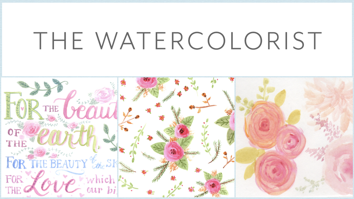
  • decorative art

  • surface patterns

  • hand lettering

  • crafts

  • coloring pages

  • floral illustration

  • graphic design (thanks to my *other* work in book publishing!)

  • digital art

So at this point, I had found what I liked to do, but still had a number of related but separate interests.

Once I finally buckled down and really started to build an actual business, there was also the problem of figuring out what was going to stick. Having multiple interests combined with a variety of business options, there were a lot of false starts. I’ve explored self-published coloring books, a craft blog, art licensing, freelance illustration, print-on-demand sites, stock art, craft shows, heck even knitting patterns and doll clothes… It has been exhausting! Finally, I realized I could funnel many of my skills and interests into creating digital art products and templates. So now that’s become my main objective in my art business!

Today, I still struggle with focus—kids might have something to do with that—but I think I’m narrowing in on my niche. It is always evolving. Maybe I’ll narrow it down even more. Maybe I’ll try something else altogether. Who knows what road I’ll explore in the future. We’ll just have to wait and see where my journey takes me!

—Nicole

My Artistic Personalities

When it comes to artistic style, it is usually best to just create and let it develop naturally. I’ve been struggling, however, with my own. I feel like I have split personalities that are all me, and yet not me at the same time (if that makes any sense). In other words, I don’t feel like I’ve settled on what makes my style unique just yet. So I thought I’d take time for a little analysis, because I think a little self-awareness is good. The process shouldn’t be entirely passive.

 To start, I went through my catalog of artwork and divided by similarities. As I did this, I found certain styles and phases I’ve gone through as I’ve developed as an artist. Then I went through and listed what it is I liked and didn’t like about each method, so that perhaps I can find my perfect mix.

The Watercolorist

Overview

My watercolor art tends to be semi-realistic and soft. I use light, quick washes of color to create a more painterly effect.

Media

Watercolor paint, of course, but I’ve also created similar works using markers and ink.

Pros

I like the handmade quality of paintings, and it is very suitable for florals and botanical work.

Cons

I feel that my skills in painting traditionally are still a bit lacking, but I just need some practice. As a lot of my pieces end up onscreen, scanning and color correcting can sometimes be a challenge, as is creating repeats for patterns. Watercolor as a medium itself is not my favorite.

The Doodler

Overview

I had a phase where I put a lot of emphasis on line. I enjoyed creating intricate designs, mandalas, and zentangle-type drawings.

Media

Primarily pen and marker, but also things like chalk and pencil. Some of my adult coloring pieces were finished digitally with the pencil tool in Illustrator.

Pros

This is a good style to use for adult coloring pages and jobs that require black and white only. I like the quality of hand-drawn doodles and intricate patterns.

Cons

I’m finding that nowadays, I like to emphasize shape, color, and texture more than line work. But I think I could still find a place for lines.

The Graphic Designer

Overview

This is the side of me that loves all things digital, from vectors to typography. This type of work uses a lot of flat geometric shapes, clean lines, and some patterns.

Media

Digital software such as Adobe Illustrator, Photoshop, and Indesign.

Pros

Being a book designer for many years, I love to work with type and study font design—great for page design and things like greeting cards. Although I love to draw and paint on paper, I also love to play around with vectors in Illustrator and create art with simple shapes and clean lines. This style is well-suited for surface design as using vectors makes scaling and repeating easier. Also good for work involving graphic icons.

Cons

It’s a little more difficult to add personality to vector work. Unless you are drawing freehand with the pencil tool, it can often look rather cold and generic as it doesn’t have your unique drawing handprint, but that’s not to say it’s impossible. There are lots of great vector artists out there. While there are ways to add texture to vectors, I tend to stick to flat colors with vector work, which has it’s good and bad points as well.

midcentury.jpg

The Mid-century Illustrator

Overview

This is a style most prevalent in my recent work. This style feels vintage and hand-painted. It’s a little fun and quirky, and there is an emphasis on flat stylized shapes and bright colors. Big influences include Mary Blair and Rifle Paper Company products.

Media

Gouache paint is a popular medium in this style, and other media that can create similar flat layers of solid color. I’ve used acrylic paint, marker, and digital brushes in Procreate or Photoshop.

Pros

I like the use of flat stylized shapes found in vector work I’ve done, but this introduces a more painterly, handmade quality. Very suitable for children’s illustrations, pretty florals, and happy holiday designs.

Cons

As mentioned under The Watercolorist, I feel that my painting skills still needs work to get to where I want it to be, and physical art needs to be scanned and color corrected. This isn’t a problem with digital work, though! This style tends to be simplified, so I’d like to find a balance of using flat shapes with my love of intricate pattern. Enter folk art…

The Folk Artist

Overview

This evolved from the mid-century style. It has the same flat shapes and colorful palettes, but with the added use of lots of PATTERN. I’m often inspired by various forms of decorative folk art such as naïve Americana, Norwegian rosemaling, and Ukranian pysanky Easter eggs. It can also be very painterly.

Media

This suits both traditional and digital media. I’ve recently developed a love of acrylic paint for its ease of use and ability to create opaque layers and wonderful painterly textures.

 Pros

This style incorporates many things I love—bright color palettes, pattern, and stylized shapes. Very suitable for decorative work, which is the bulk of my art.

 Cons

I love painterly textures, but not sure if it’s best for surface pattern work, where flat colors are more prevalent and practical when creating colorways and separations.

crafts.jpg

The Crafter

Overview

This one’s a bit of a wildcard. I’ve always loved to craft in many forms. I’ve recently been exploring illustration that uses hands-on methods or is inspired by crafts, such as paper art, collage, embroidery, quilting, and digital art made to look handmade (such as my digital felt flowers).

Media

Various craft supplies—such as embroidery, fabric, beads, paper, yarn, glitter, and paint (and their digital equivalents).

Pros

This type of art makes use of many of my skills—crafting, design, painting, and drawing. Digital pieces present other fun challenges that appeal to my technical side. Things like scrapbooking incorporate graphic design elements and photography, which I also love.

Cons

Although I want to continue experimenting, it’s probably not a practical avenue in the long-term as far as my illustration goes. It’ll be best used for specialized projects such as scrapbooking embellishments and crafts for my Etsy shop.

Summary

In creating this list of my artistic “personalities,” I’ve found a few common threads that I feel are totally ME: 

  • Florals. There will always be florals and botanical elements in my work. It is my favorite subject matter and is found throughout my work regardless of medium or style.

  • Pattern and detail. Pattern is always present as well, whether in creating surface designs themselves or incorporating pattern details in my illustrations.

  • Bright color. When it comes to color, I tend to favor bright, saturated palettes and jewel tones over neutrals or pastels. Perhaps this is due to my love of flowers!

  • Handmade feel. I love my clean vectors, and they have their purpose, but I think in general I like it when my work has a more handmade quality, even in its digital forms. I think going forward, I can achieve this by incorporating more texture, freehand drawing, and traditionally painted elements.

Other observations: Many of these seemingly distinct styles bleed into one another. I don’t just switch from one to another. Rather, I incorporate different elements as I go. I also think that, for me (not everyone), it is best not to get tied to any one medium. I like creating digital and traditional art pretty equally, and I think I would get bored sticking to just one or the other. I think I can still find a unique style that works across several methods. Though it might make things a tad more complicated, it’s not impossible. Each medium has their pros and cons, so it’s just a matter of what’s needed for the specific project.

I really enjoyed this exercise, and I think it will be very helpful as I continue to develop as an artist. It was sure fun to see how things have evolved over time. I think I am growing in confidence every day, and all these phases I’ve gone through are stepping stones. Thanks for bearing with me as I go through this process, and I hope my fellow artists get something useful out of it!

Sincerely, Nicole

Six Mistakes I've Been Making in my Surface Pattern Design

I've been making patterns for several years. Even now, I feel I still have a lot to learn. Though I have had a formal art education, it was not specific to textile or surface design—I discovered my love for patterns later on. In addition, I don't have a ton of professional experience when it comes to pattern design—mostly I create for my personal POD shops, like Spoonflower, and to build my portfolio. Obviously, it is a goal of mine to take my designs as far as I can go. I've been evaluating my process lately, and I think there are some mistakes that I always make that I need to work on. I thought I'd share my thoughts, in the hopes that my fellow pattern lovers can learn from them, too!

NS_ArtBlog_181009_6MistakesSPD.jpg

1. Skipping Research

I'm just awful at this. Like many others, I'm sure, I get excited about an idea and dive right in. I barely even do any sketching! I think a lot of my patterns could be a lot better if I'd taken the time to soak in some related imagery, experimented with forms and compositions, and worked things out in sketches. Considering trends would help make my work more marketable as well. With all this in mind, I've been working this month with my Inktober project to learn about different flowers and plant structures. Since I do a lot of florals, I'm hoping this will improve my work overall.

2. Making my repeats too small

A lot of the time I make my repeats the size of Spoonflower swatches (8x8 inches), or sometimes 12x12 (a standard scrapbook paper size). Lately, I'm beginning to realize that perhaps I am making my repeat swatches too small. Having a larger size base pattern has the advantage of avoiding obvious sections of repeats within the bigger swatch. According to this excerpt from a textile handbook, repeats should be scaled to the width of the fabric (24 inches and above). This could be divided into a smaller division of the total size. Somewhere between 14 and 16 inches is common—still larger than my usual. Of course, this all depends on the end goal of your pattern and the process by which it will be manufactured. Which brings me to my next mistake...

 3. Having no end product in mind

There are many questions I should be asking myself when I approach a new design: Is this design for stationery, apparel fabric, upholstery fabric, wallpaper, gift wrap, etc.? Who is my ideal audience/customer and what do they like? Mostly I just tend to draw something pretty and make a pattern out of it, but if I plan to sell my designs, I need to think beyond that. Knowing what the end goal is will inform many choices—style, scale, colors, and limitations with manufacturing, and so on.

 4. Designing single patterns and not collections

My portfolio is full of single patterns that were done for challenges or quickly done for fun, and never thought of again. My approach needs to change to focus more on creating fully conceived collections. I've written about this previously. I think I have a hard time with this because of my short attention span. It is hard for me to stay devoted to one project for too long. I need to work on my artistic endurance, so to speak!

5. Not turning my work upside down

When considering all-over patterns that are meant to be viewed from any direction, it makes sense that we should make sure the patterns truly work from any view. It seems obvious, yet I've hardly ever turned my design around as I'm working. And it's so simple just to turn your paper, or rotate your digital canvas. Usually, I just place my elements in random directions and call it good, but I came to the realization one day when looking at a printout of one of my patterns that you can recognize new issues when you turn your design over. And this brings me to my final point...

6. Not printing out my patterns

I don't know how many times I've uploaded a design to Spoonflower and ordered a swatch only to find that I did not like the scale, colors, composition, or something else. I finally had an "Aha!" moment and started printing out swatches on my inkjet printer. I don't know why I never did it before—laziness? saving paper?—but it really helps to see your design printed out, especially if you work digitally. You can recognize issues that you might not see onscreen. Sometimes I just print a low quality "draft" version (because ink is ex-pen-sive), and though that won't help as much with color, you can still get a sense of the scale and overall composition of your design. (Make sure you print at 100% to get an accurate representation.)

So those are six things I'd like to work on in my surface pattern design process. I hope this is helpful to you as well! Please let me know what advice you have. I’d love to hear from you.

Sincerely, Nicole

Inktober 2018 and How I Approach Art Challenges

October is upon us, which means Halloween, colorful leaves, cooling weather, and INKTOBER.

IMG_3167.jpg

For those who do not know about Inktober, it is a drawing challenge created by Jake Parker where artists create illustrations using ink and share them throughout the month of October. (You can learn more at the official site HERE.)

There is an official prompt list provided, but usually I use my own themes. One year, I did little pattern doodles on index cards, and another year, I worked on my brush lettering. This year, I've decided that I want to focus on learning about types of flowers and plants. If you know anything about my work, you know that I LOVE to work with floral designs. However, I usually make them up as I go. I've always been meaning to dive more in depth into the structure and forms of actual species of flora.

I thought I might take this opportunity to further explain my personal approach to art challenges. I love to participate in various art challenges across the web and social media. (Some of my favorites include Homwork and Spoonflower.) Many of these challenges are daily or weekly. It is such a fun way to engage with other artists, learn new skills, build habits, and get your art seen. However, it can be overwhelming, especially with all the different ones out there!

I've really been focusing on making creative habits this year, so art challenges really help with this goal since it gets me drawing and painting on regular basis. The thing is, it's easy to fall off the wagon. These are some of the guidelines I follow as I participate:

  •  Don't be discouraged if you miss a day/week. It's not the end of the world. In fact, I really only participate in those that inspire me personally. And if I miss one because of time, I just continue with the next. Don't feel the need to "make up" the ones you miss—that just adds unnecessary pressure.

  • Find a way to be productive with your art challenges. In the past, I haven't been great at this and just did whatever. Now I am realizing there's a better approach. Yes, you can just use challenges for routine sketching exercises and social media exposure, but why not go further? Use your daily sketches to work on a skill you want to improve, or develop an illustration or collection idea you’ve been wanting to work on. Perhaps even aim to sell your original artwork or prints. Have a purpose going in. For instance, I am using this year's Inktober to study plant species. I have an end goal that is specific to my work.

  • As always, follow the usual advice: Plan ahead and set aside a specific time—the basics to success with art challenges.

  • Oh, and have FUN!

So with all this in mind, I've come up with the following list for Inktober 2018 and mapped out each day with the various plant life I want to explore. And because it's October, I'll be adding some Halloween elements as well!

In addition, I took the extra step to hand craft a sketchbook specifically for my Inktober drawings. I used THIS old tutorial from my sister Dani Jones. I decorated the cover with floral scrapbook paper and added in some spider details with ink. The paper is heavyweight Bristol, so the ink won't bleed through. I might have gotten some blood on the pages when I poked my finger while sewing up the signatures, but that just adds to the whole Halloween theme, right? Haha.

IMG_3142.jpg
IMG_3141.jpg

Follow along daily on my Instagram (@nicolejonessturk). I'll be adding my own unique hashtag #njsinktober2018 as well. If you use any of my prompts, please tag me so I can see!

Happy October!
Nicole