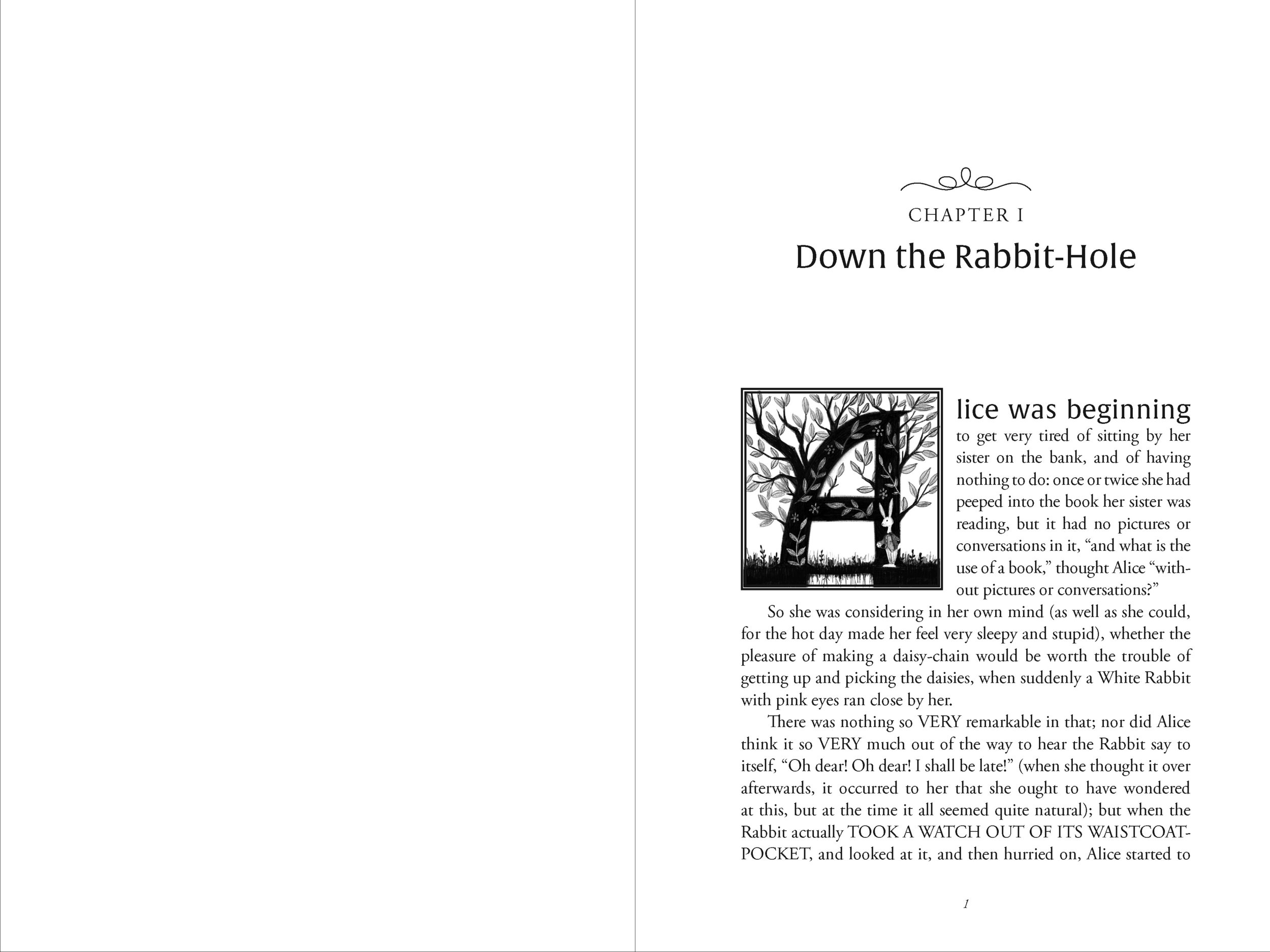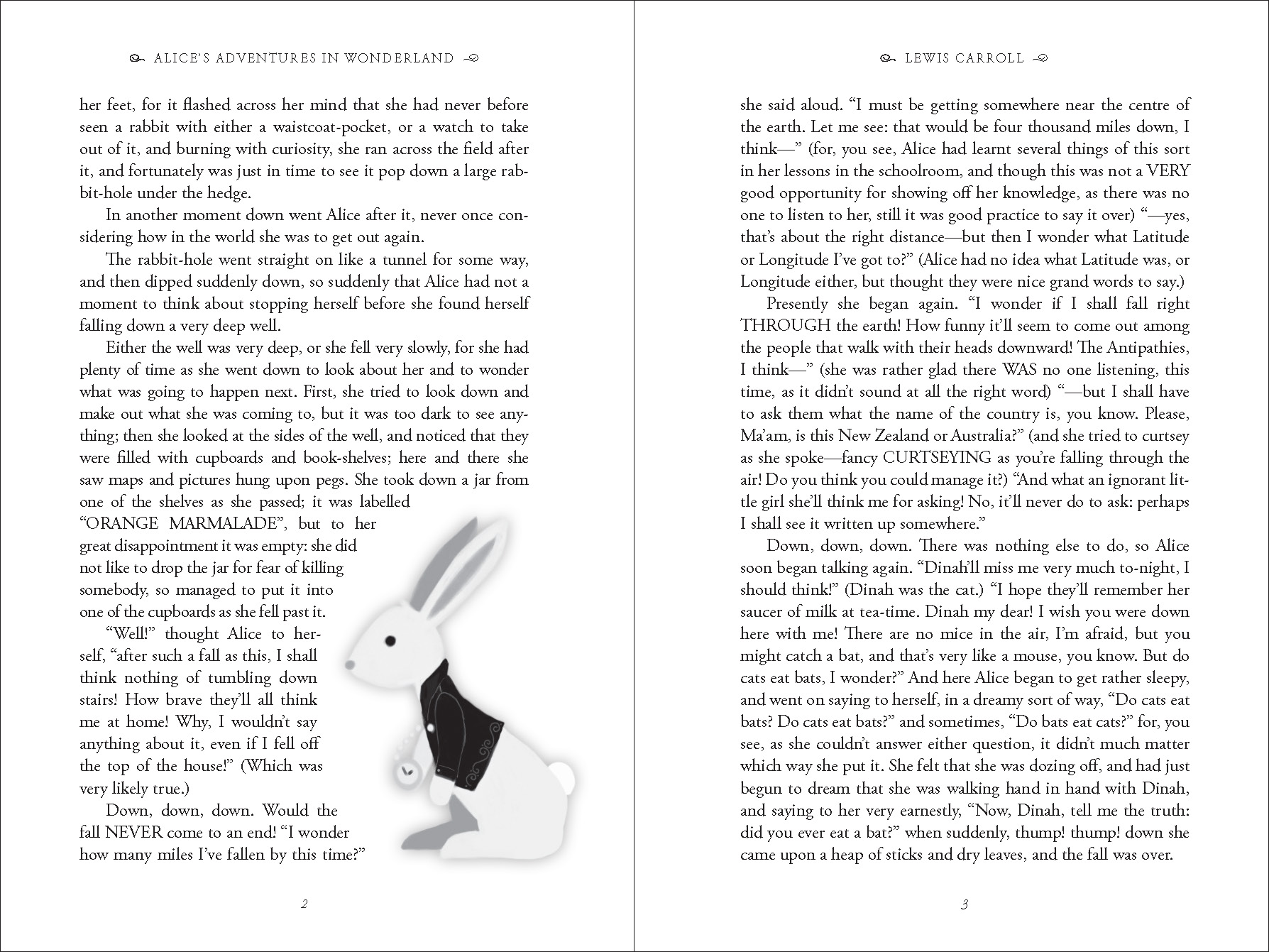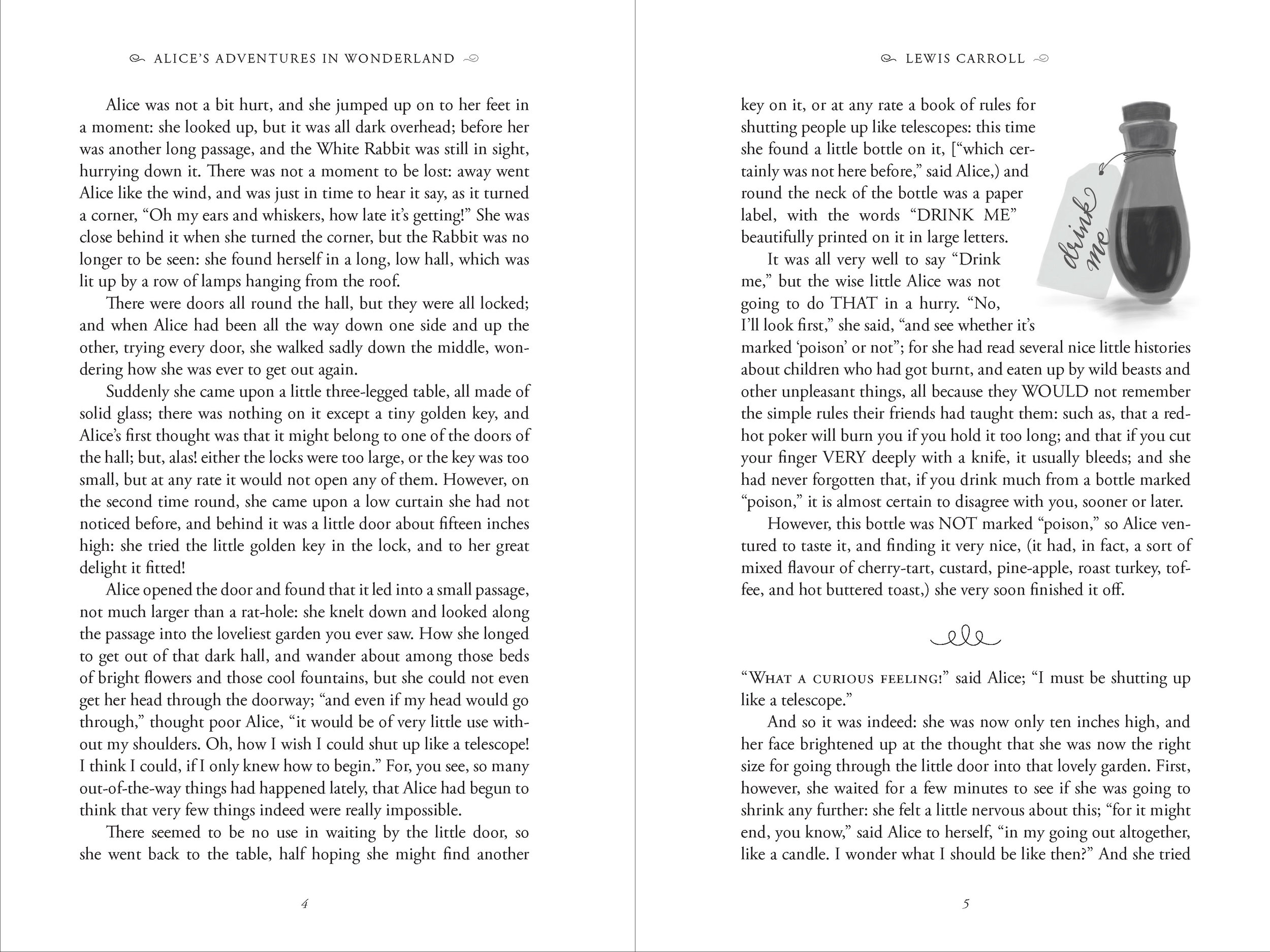
When it comes to artistic style, it is usually best to just create and let it develop naturally. I’ve been struggling, however, with my own. I feel like I have split personalities that are all me, and yet not me at the same time (if that makes any sense). In other words, I don’t feel like I’ve settled on what makes my style unique just yet. So I thought I’d take time for a little analysis, because I think a little self-awareness is good. The process shouldn’t be entirely passive.

To start, I went through my catalog of artwork and divided by similarities. As I did this, I found certain styles and phases I’ve gone through as I’ve developed as an artist. Then I went through and listed what it is I liked and didn’t like about each method, so that perhaps I can find my perfect mix.
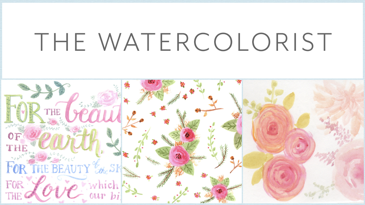
The Watercolorist
Overview
My watercolor art tends to be semi-realistic and soft. I use light, quick washes of color to create a more painterly effect.
Media
Watercolor paint, of course, but I’ve also created similar works using markers and ink.
Pros
I like the handmade quality of paintings, and it is very suitable for florals and botanical work.
Cons
I feel that my skills in painting traditionally are still a bit lacking, but I just need some practice. As a lot of my pieces end up onscreen, scanning and color correcting can sometimes be a challenge, as is creating repeats for patterns. Watercolor as a medium itself is not my favorite.

The Doodler
Overview
I had a phase where I put a lot of emphasis on line. I enjoyed creating intricate designs, mandalas, and zentangle-type drawings.
Media
Primarily pen and marker, but also things like chalk and pencil. Some of my adult coloring pieces were finished digitally with the pencil tool in Illustrator.
Pros
This is a good style to use for adult coloring pages and jobs that require black and white only. I like the quality of hand-drawn doodles and intricate patterns.
Cons
I’m finding that nowadays, I like to emphasize shape, color, and texture more than line work. But I think I could still find a place for lines.

The Graphic Designer
Overview
This is the side of me that loves all things digital, from vectors to typography. This type of work uses a lot of flat geometric shapes, clean lines, and some patterns.
Media
Digital software such as Adobe Illustrator, Photoshop, and Indesign.
Pros
Being a book designer for many years, I love to work with type and study font design—great for page design and things like greeting cards. Although I love to draw and paint on paper, I also love to play around with vectors in Illustrator and create art with simple shapes and clean lines. This style is well-suited for surface design as using vectors makes scaling and repeating easier. Also good for work involving graphic icons.
Cons
It’s a little more difficult to add personality to vector work. Unless you are drawing freehand with the pencil tool, it can often look rather cold and generic as it doesn’t have your unique drawing handprint, but that’s not to say it’s impossible. There are lots of great vector artists out there. While there are ways to add texture to vectors, I tend to stick to flat colors with vector work, which has it’s good and bad points as well.

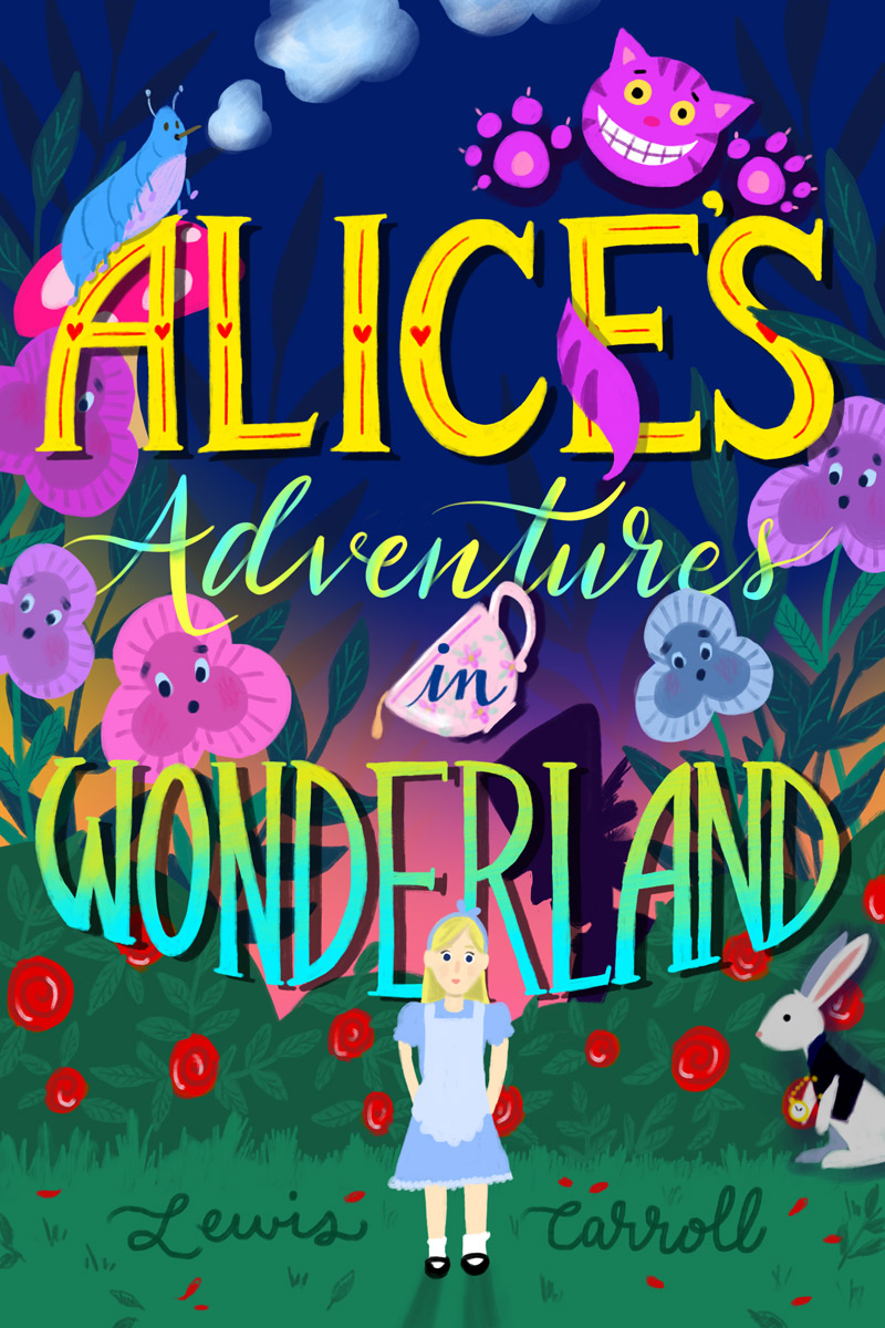
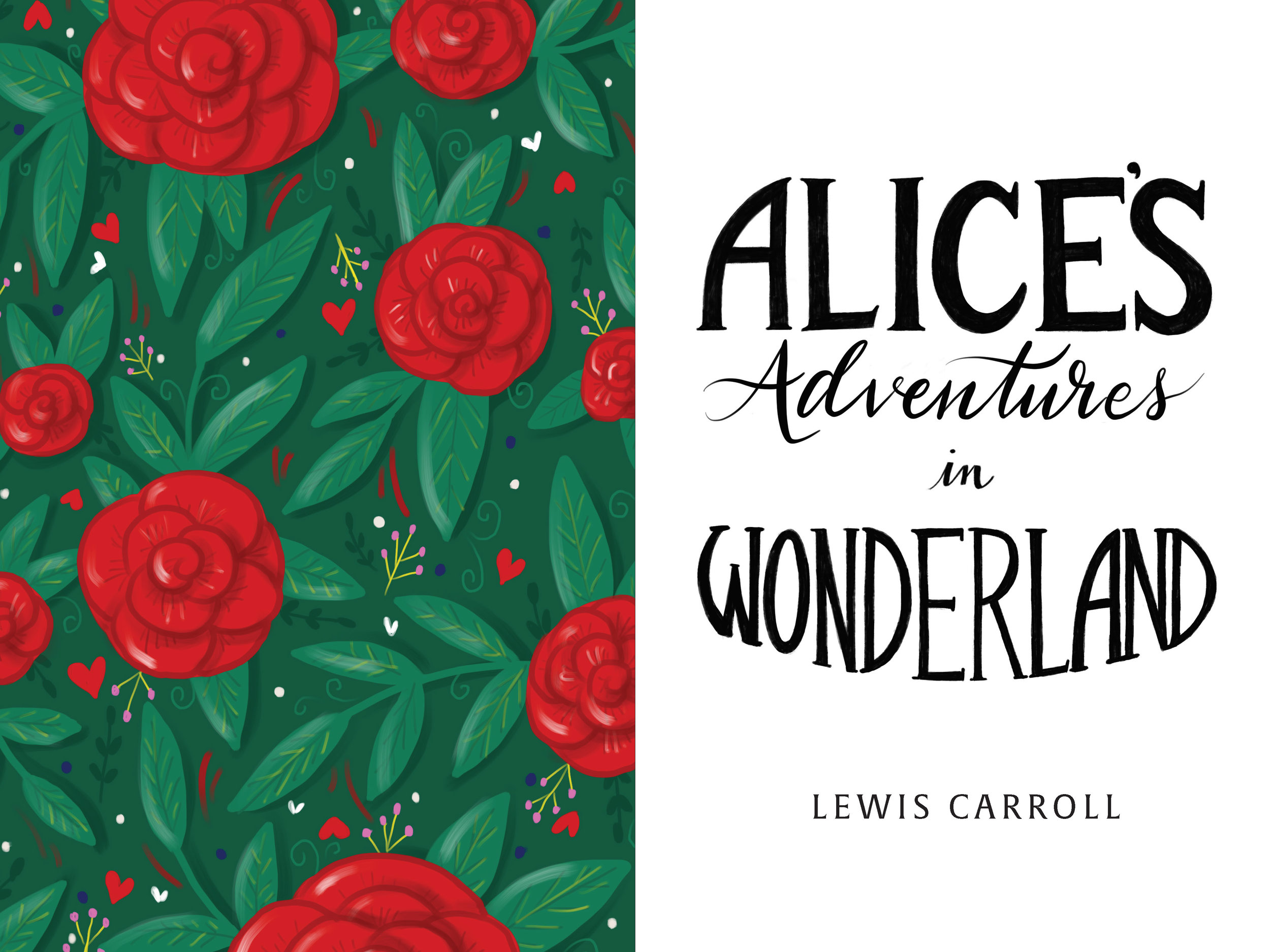
The Mid-century Illustrator
Overview
This is a style most prevalent in my recent work. This style feels vintage and hand-painted. It’s a little fun and quirky, and there is an emphasis on flat stylized shapes and bright colors. Big influences include Mary Blair and Rifle Paper Company products.
Media
Gouache paint is a popular medium in this style, and other media that can create similar flat layers of solid color. I’ve used acrylic paint, marker, and digital brushes in Procreate or Photoshop.
Pros
I like the use of flat stylized shapes found in vector work I’ve done, but this introduces a more painterly, handmade quality. Very suitable for children’s illustrations, pretty florals, and happy holiday designs.
Cons
As mentioned under The Watercolorist, I feel that my painting skills still needs work to get to where I want it to be, and physical art needs to be scanned and color corrected. This isn’t a problem with digital work, though! This style tends to be simplified, so I’d like to find a balance of using flat shapes with my love of intricate pattern. Enter folk art…

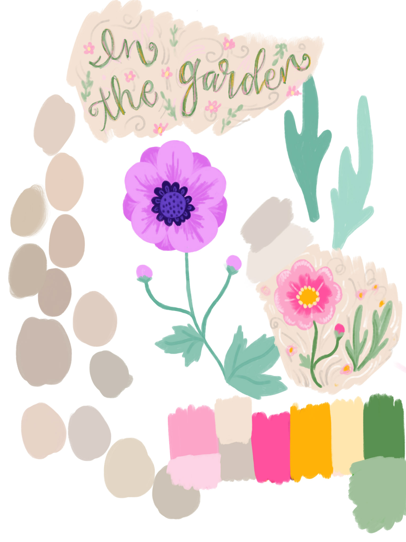
The Folk Artist
Overview
This evolved from the mid-century style. It has the same flat shapes and colorful palettes, but with the added use of lots of PATTERN. I’m often inspired by various forms of decorative folk art such as naïve Americana, Norwegian rosemaling, and Ukranian pysanky Easter eggs. It can also be very painterly.
Media
This suits both traditional and digital media. I’ve recently developed a love of acrylic paint for its ease of use and ability to create opaque layers and wonderful painterly textures.
Pros
This style incorporates many things I love—bright color palettes, pattern, and stylized shapes. Very suitable for decorative work, which is the bulk of my art.
Cons
I love painterly textures, but not sure if it’s best for surface pattern work, where flat colors are more prevalent and practical when creating colorways and separations.

The Crafter
Overview
This one’s a bit of a wildcard. I’ve always loved to craft in many forms. I’ve recently been exploring illustration that uses hands-on methods or is inspired by crafts, such as paper art, collage, embroidery, quilting, and digital art made to look handmade (such as my digital felt flowers).
Media
Various craft supplies—such as embroidery, fabric, beads, paper, yarn, glitter, and paint (and their digital equivalents).
Pros
This type of art makes use of many of my skills—crafting, design, painting, and drawing. Digital pieces present other fun challenges that appeal to my technical side. Things like scrapbooking incorporate graphic design elements and photography, which I also love.
Cons
Although I want to continue experimenting, it’s probably not a practical avenue in the long-term as far as my illustration goes. It’ll be best used for specialized projects such as scrapbooking embellishments and crafts for my Etsy shop.
Summary
In creating this list of my artistic “personalities,” I’ve found a few common threads that I feel are totally ME:
Florals. There will always be florals and botanical elements in my work. It is my favorite subject matter and is found throughout my work regardless of medium or style.
Pattern and detail. Pattern is always present as well, whether in creating surface designs themselves or incorporating pattern details in my illustrations.
Bright color. When it comes to color, I tend to favor bright, saturated palettes and jewel tones over neutrals or pastels. Perhaps this is due to my love of flowers!
Handmade feel. I love my clean vectors, and they have their purpose, but I think in general I like it when my work has a more handmade quality, even in its digital forms. I think going forward, I can achieve this by incorporating more texture, freehand drawing, and traditionally painted elements.
Other observations: Many of these seemingly distinct styles bleed into one another. I don’t just switch from one to another. Rather, I incorporate different elements as I go. I also think that, for me (not everyone), it is best not to get tied to any one medium. I like creating digital and traditional art pretty equally, and I think I would get bored sticking to just one or the other. I think I can still find a unique style that works across several methods. Though it might make things a tad more complicated, it’s not impossible. Each medium has their pros and cons, so it’s just a matter of what’s needed for the specific project.
I really enjoyed this exercise, and I think it will be very helpful as I continue to develop as an artist. It was sure fun to see how things have evolved over time. I think I am growing in confidence every day, and all these phases I’ve gone through are stepping stones. Thanks for bearing with me as I go through this process, and I hope my fellow artists get something useful out of it!
Sincerely, Nicole