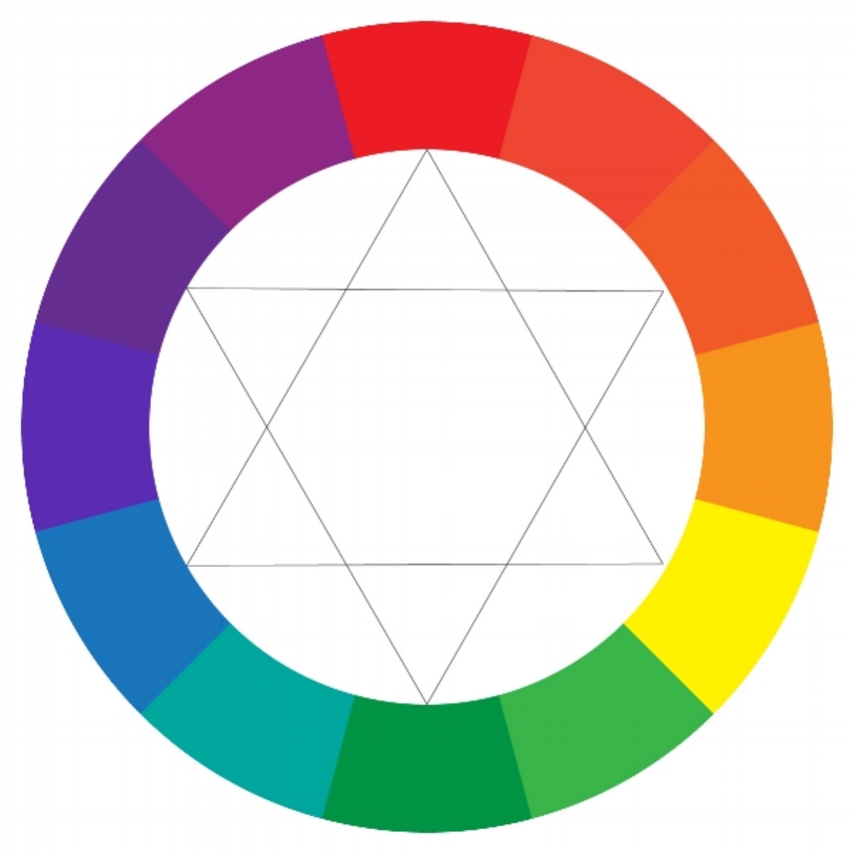
Primary, secondary, tertiary, monochromatic, analogous, complementary, split-complementary, triad, warm, cool, neutral... Do you need to memorize all these terms? In my opinion—no. If you're anything like me, when you begin a project, you don't sit down with the color wheel and think, maybe I'll use a split-complementary color scheme in warm hues. Maybe you do—no judging here—but I think it's a more intuitive process for most people, meaning a lot of experimenting and playing around.
OK, well, I lied. If you're serious about art (and I'm assuming you are if you're reading this) than you should at least learn the basics. I mean, if you're physically mixing paint colors, obviously you need to know how colors blend together. (For instance, did you know that combining complementary colors creates a neutral? I talk more about this later...) If you're working professionally, or plan to in the future, you'll want to be able to communicate with your clients about color. I'm not going to go into all those terms in depth here, though—there are plenty of resources out there about color theory. I simply want to talk about the process of creating a color palette.
What's MORE important than knowing the color wheel inside and out is knowing what it is that makes a color palette effective. There are no hard and fast rules saying you can't combine one color with any of the others. It's how you do it. You'll also need to consider the purpose for your piece, as well as the mood you are trying to evoke so that you choose a color scheme that helps attain those end goals. By all means, you can (and should) still play around with your colors, but it's good to have a little knowledge to back up your decisions, and perhaps make the process more efficient for you. Here are four things that I feel are more important than knowing whether your palette is analogous or tertiary...

1. Contrast
Whenever I create a design that I think looks (for lack of a better word) boring, 90% of the time I can trace it back to a lack of contrast—more specifically, contrast of values (or lights and darks). I think contrast is one of the key elements of a good color palette. Without it, a design tends to look flat and uninteresting. To achieve good value contrast, usually you want one nice dark color, one very light color, and a variety of shades in between. Sometimes it can be difficult to accurately assess your light/dark contrast when you become distracted by the different hues and shapes (for instance, bright colors might seem lighter than they actually are), so one trick is to look at your design, or palette, with squinted eyes. It also helps to stand at a distance. The idea is to blur out the image so all you see is the impression of how the lights and darks are working in your piece. If you're working digitally, you can also simply view your piece in grayscale mode. If your design looks like all one boring shade of gray, you might want to tweak your palette.


2. Harmony
Now that I've addressed the need for variety and contrast in a design, I must also add that the colors must, of course, still work together as one, creating harmony. Here are a few ways to create color harmony:
Use similar hues
This could be a two colors like blue and green, or different shades of one color (this would be analogous or monochromatic if you want to get all technical). This isn't always the most fun way to go, so luckily there are other ways to create harmony...

Monochromatic color scheme
Temperature
You may already know that blues and purples are considered "cool" while reds and oranges are "warm," but to go further, there are warm and cool variations of all hues. You can absolutely have a warm palette that includes blue, or a cool palette with red—but whether warm or cool, it should be either one or the other, not a mix.
Cool colors

Warm colors
Saturation
This refers to how bright or dull a color appears. Highly saturated colors are pure and vivid, while less saturated colors are more muted and neutral, which happens when you mix black or white to a base color (also referred to as "tints" and "shades"). Going back to that color wheel (yeah, I guess it does come in handy) mixing a hue with its complement (or a color that appears across from it) will also make a color more neutral. Having similar levels of saturation throughout your palette can help create harmony. That being said, you'll probably still want to reserve the brightest, most saturated colors to add "pops" of color and accents, since bombarding the eye with too many saturated colors throughout your piece can cause visual fatigue (this goes back to the idea of contrast). That's not to say you can't have all bright or all soft colors in your design. There's mood and purpose to consider as well...
3. Mood and Purpose
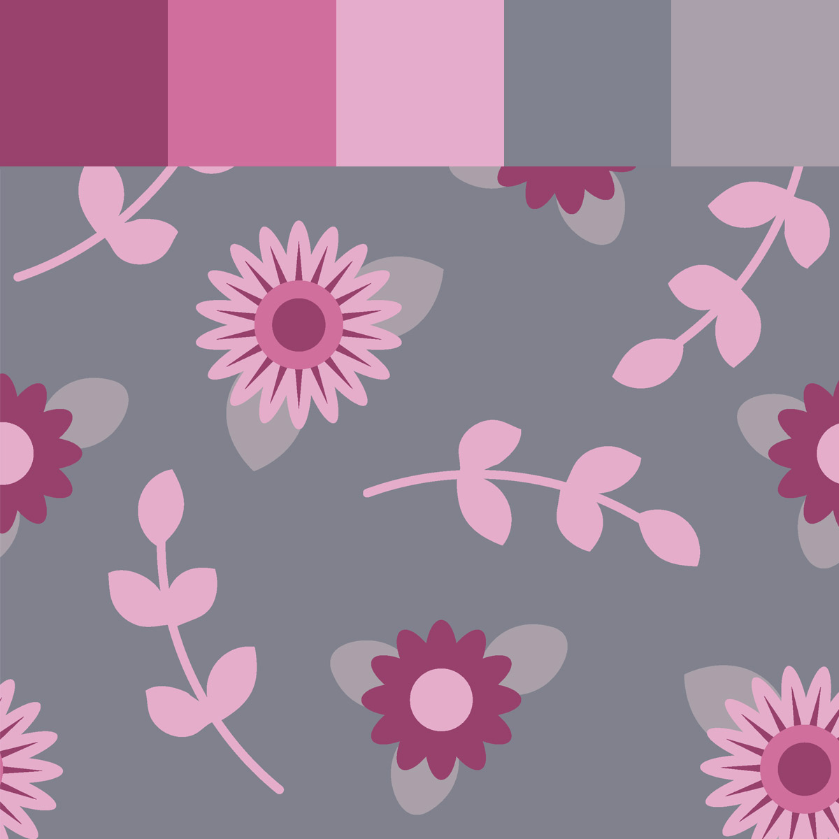
When you start a piece, do you ask yourself why you're creating it? For example, if you're designing a surface pattern, what is the end purpose—fabric for quilting, wallpaper, clothing? Who are you making this for? The answers to these questions should be directing your decisions throughout the entire process, including color choices. There are a few key points to consider regarding mood:
Psychology of Color
There are deep connections between color and emotions. They can spark feelings of excitement, peace, fun, anger, happiness... you get the picture. You can also use color to convey moods, such as rustic, natural, or urban. People have written loads about the psychology of color, and it is interesting to research. When you approach your design, step back and look at your colors and focus on the emotions and images they evoke. Are those the same ideas you want your overall design to present?
Holidays and seasons
People make automatic associations between specific colors and holidays and seasons. One obvious example is pairing Christmas with red and green. It's good to keep this in mind if you're designing a seasonal piece.
Your Audience
Evaluate who your design needs to appeal to and let that guide your color decisions as well. For example, soft pastels are often used in feminine or baby designs. Darks and neutrals are more masculine. Designs aimed at toddlers and kids are usually full of bright, saturated colors.
4. Finally, there are always exceptions.
When it comes to color, there are no solid rules. Use your intuition and do what looks and feels right to you. Perhaps take these guidelines, and turn them upside down to create something unexpected. Sometimes breaking the rules makes the most impact!
I hope you find these guidelines helpful. As always, enjoy the process. Art—and color—is fun!
Sincerely, Nicole