Now that I've discussed how to create an effective color palette, let me also mention that there's another way easier method—just use a color palette that already exists! When I'm working on a new design, I don't always develop my color scheme from scratch. I am constantly finding color inspiration and building a library of swatches and palettes that I can pull from when I need it. If I already have one on hand that would work great for my project, I take it and tweak it to fit my needs.
Color Palette Resources
There are numerous resources out there for finding color palettes. These are just a few that I use myself on a regular basis:
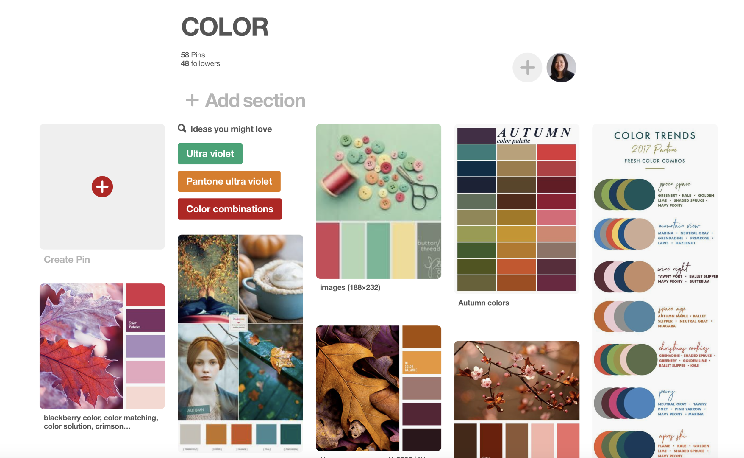
Is there no greater design resource? I mean, really, this one of my top places to find ideas for ANYTHING—art, cooking, crafts, home, and more. Nothing could be easier than typing "color palettes" into the search bar and seeing what pops up. You can get lost for hours pinning away.
Websites and apps
There are a number of websites and mobile apps tailored just for creating and discovering colors. You can view the palettes created by members of the community, or create your own. I've linked to a list of good sites and apps below.
Other art, patterns, photos
Use the above mentioned mobile apps and your camera phone to pull colors from physical items, such as photos, artwork, fabric swatches, or nature.
Pantone
Pantone is a standard color resource for designers and always a good place to start. They offer a number of products and resources for designers, including their own palettes that you can download for use in Adobe applications, such as Photoshop or Illustrator. (Psst... Stay tuned for more on my take on 2017's Pantone Color of the Year, Ultra Violet.)
Color Palette Inspiration
For some instant inspiration, here are some favorite color schemes I like that I've come across lately:
I feel that I tend to lean towards deep, saturated colors, especially jewel tones.


I'm also a sucker for anything with pink or red, my favorite colors. Pink and green tends to be my default color combination when I'm sketching florals.


Autumn hues make me happy because they remind me of my favorite time of year.


I love to see bright pops of color in more desaturated palettes.


Examples in My Work
Spoonflower occasionally uses a limited palette to inspire one of their weekly design challenges. Here are a couple that I've participated in.


This last design was created for the current design challenge. It's open to public voting on February 15th and closes on the 20th. (EDIT: Voting now closed)
I hope you are excited to get out there and explore all the color around you. Till next time!
Sincerely, Nicole
Links
Beyond Basic Color Theory—Four Things More Important Than the Color Wheel
Color Meaning, Symbolism, And Psychology: What Do Different Colors Mean (a great article on the meanings of different colors)
Web and mobile app resources
12 Best Color Scheme Generator Web Apps for Designers (Designmodo)